KacstOne font v5.0
Just released version 5.0 of KacstOne font, the new release features a new bold version of the font, it should also be possible now to copy text from PDF files using KacstOne, also the problematic kern feature have been removed as it was causing more problems (both Qt and OpenOffice have bugs in handling of right to left kerning) and a simplistic font like KacstOne can do without kerning at all (I had to fix the advance widths of certain glyphs the needed kerning more). Download it from SourceForge. The most interesting part in this release is the bold font. Arabic scripts has a very strong calligraphic tradition and even a simplistic font like KacstOne carries many of the aspects of this calligraphic nature. One of these aspects is the change in stem width as the pen rotates. FontForge has a “change weight” feature that emboldens the glyphs by stroking them then removing the internal contours, however it does so uniformly i.e. all parts of the glyph are expanded the same way (it has some heuristics for Latin, but it does not apply here), however I want to expand the wider parts of the stroke more than the narrower parts keeping the ratio constant. Inspired by FontForge’s method I had this idea of stroking the glyphs using a diagonal pen instead of the rounded one used by FontForge’s “change weight”. After some experimentation I ended with the following parameters to “expand stroke” tool: elliptical, 100, 30, 40, butt, miter, for pen type, main stroke width, minor stroke width, line cap and line join, respectively.
And here is a caparison of FontForge’s method (right) and mine:
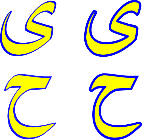
(the yellow colour is the original glyph and blue is the emboldened one)
Not very perfect, as you can see the lower half of the Haa (bottom row) got it reversed, but IMO is much better than FontForge’s default.
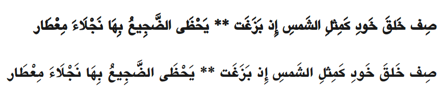
And here is a line of text set in FontForge emboldened font (top) and KacstOne 5.0: